Matching The Data
Two files describing the same thing — the financial health of a company — in two incompatible vocabularies. Nothing can be borrowed until they line up.
Taiwan
6,819 companies. 95 ratios, each with a proper name. Numbers already squashed into a 0-to-1 range.
Poland
Up to 10,503 companies. 64 ratios with the names stripped out. Original numbers, untouched.
Common Ground
17 ratios that exist in both, with every company measured against others in its own country.
Pairing up the columns
Poland’s columns are anonymous. Attr6 tells you nothing until you look it up in the dataset’s documentation and find it means retained earnings divided by total assets — profit the company kept rather than paid out.
Every pair has to be matched by hand against that documentation. That makes this the easiest place in the whole project to introduce a silent mistake: mistype one column name and the model still trains, still scores, and still produces a believable-looking number. Nothing crashes. You simply get a wrong answer that looks right.
So the matching lives in a file of its own, written out as data rather than buried in analysis code — one entry per pair, each recording where the definition came from and how exact the match is. A check runs automatically and fails if any column gets claimed twice.
Pairs are matched on what a ratio actually measures, not on how similar the two names look. The anchor is a shortlist an accountant named Edward Altman published in 1968: five ratios he identified as the ones that matter for predicting bankruptcy. All five exist in both datasets, which gives the shared set a known backbone rather than an arbitrary one.
| Name used here | What it measures | Match quality | One of Altman’s five |
|---|---|---|---|
| gross margin | gross profit / sales | exact | |
| quick ratio | (current assets - inventory) / short-term liabilities | exact | |
| net profit to assets | net profit / total assets | exact | |
| ebit to assets | EBIT / total assets | approximate | yes |
| equity to assets | equity / total assets | exact | |
| current ratio | current assets / short-term liabilities | exact | |
| equity to liabilities | book value of equity / total liabilities | exact | yes |
| liabilities to assets | total liabilities / total assets | exact | |
| working capital to assets | working capital / total assets | exact | yes |
| short term liabilities to assets | short-term liabilities / total assets | exact | |
| retained earnings to assets | retained earnings / total assets | exact | yes |
| operating margin | profit on operating activities / sales | approximate | |
| sales to assets | sales / total assets | exact | yes |
| receivable turnover | sales / receivables | exact | |
| inventory turnover | sales / inventory | exact | |
| collection days | (receivables * 365) / sales | exact | |
| fixed asset turnover | sales / fixed assets | exact |
Two matches are marked approximate. In one, Poland measures profit before tax while Taiwan’s nearest equivalent is after tax. In the other, Taiwan’s documentation doesn’t say what the figure is divided by. Both are kept, but flagged, so anyone reading the results can see how much rests on a loose match.
Two things were deliberately left out. Company size — Poland records it, Taiwan has no honest equivalent. And upside-down pairs, where one file reports A divided by B and the other reports B divided by A. You can flip one to match the other in principle, but the result explodes whenever the bottom number is near zero.
The problem nobody warns you about
With the columns paired, the obvious next step is to train on Taiwan and predict Poland. It produces a coin flip. Here is why.
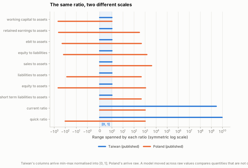
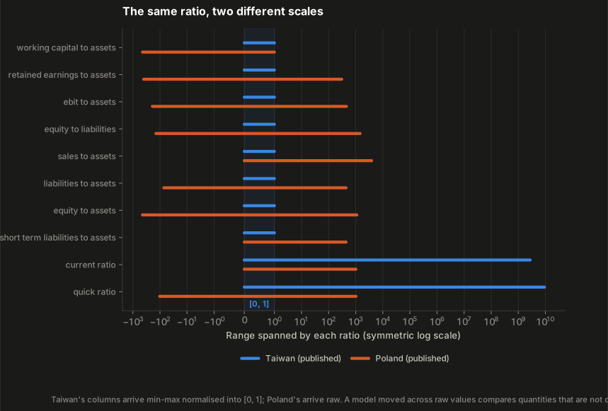
Whoever prepared the Taiwanese file rescaled every column so the smallest value became 0 and the largest became 1. The Polish file was published untouched. The same named ratio therefore lives on two completely different scales.
The consequence is concrete. A model trained on Taiwan learns rules like “flag it when the debt figure goes above 0.11”. Polish debt figures run past 400. Nearly every Polish company lands on the same side of that rule, so the model stops telling them apart at all. It still produces a number between 0 and 1 — it just no longer has anything to do with risk.
This looks like a modelling failure and isn’t. It’s a data problem, and no amount of tuning would have fixed it. You only catch it by looking at the numbers before you start.
The fix: compare each company to its neighbours
Stop comparing raw figures. Instead, replace each one with the company’s position among other companies in its own country: “this firm carries more debt than 80% of the firms around it.”
That sentence means the same thing in Taipei and in Warsaw, whatever units the original file happened to use. Rescaling a column can’t change anyone’s position in the queue — which is exactly the difference between the two files. So the comparison survives it.
This step never looks at which companies actually failed, so applying it to Poland gives the model no head start.
What it costs. Ranking throws away the absolute figure. “This company owes more than it owns” is a genuinely meaningful line to cross, and it becomes just a high position in a queue. And two companies at the same position are only equally healthy if the two countries are comparable to begin with — which, for listed Taiwanese firms against private Polish ones, they aren’t entirely. Comparability was bought with real information.
Next: does it actually work?