| Score | Varies by | |
|---|---|---|
| Model built and tested in | ||
| Poland, 1 year ahead | 0.764 | 0.024 |
| Poland, 2 years ahead | 0.775 | 0.036 |
| Poland, 3 years ahead | 0.797 | 0.014 |
| Poland, 4 years ahead | 0.801 | 0.025 |
| Poland, 5 years ahead | 0.859 | 0.018 |
| Taiwan | 0.928 | 0.017 |
Does It Work?
The borrowed model scored 0.49 on Polish companies using the published numbers — a coin flip — and 0.66 to 0.79 once each company was compared to its own country. Same model, nothing retrained.
Three numbers settle this. How well a model does on Polish companies when it was built from Polish companies — that’s the target to aim at. How well the borrowed Taiwanese model does using the numbers exactly as published. And how well the same borrowed model does once the scale problem is fixed.
NoteThe score, in one line
Pick a company that failed and one that survived, at random. The score is the chance the model rated the failing one as riskier. 0.5 is guesswork. 1.0 is perfect.
What a home-grown model achieves
Before judging a borrowed model, you need to know what’s achievable at all. Some prediction problems are simply harder than others.
A model built on Taiwanese companies and tested on other Taiwanese companies scores 0.93. Built and tested inside Poland, it manages 0.76 to 0.86.
So Poland is simply a harder problem than Taiwan. That matters for what follows: a borrowed model scoring below 0.93 on Polish companies isn’t necessarily failing to travel — Poland’s own model doesn’t reach 0.93 either. The fair comparison is against the Polish figure.
The borrowed model, tried two ways
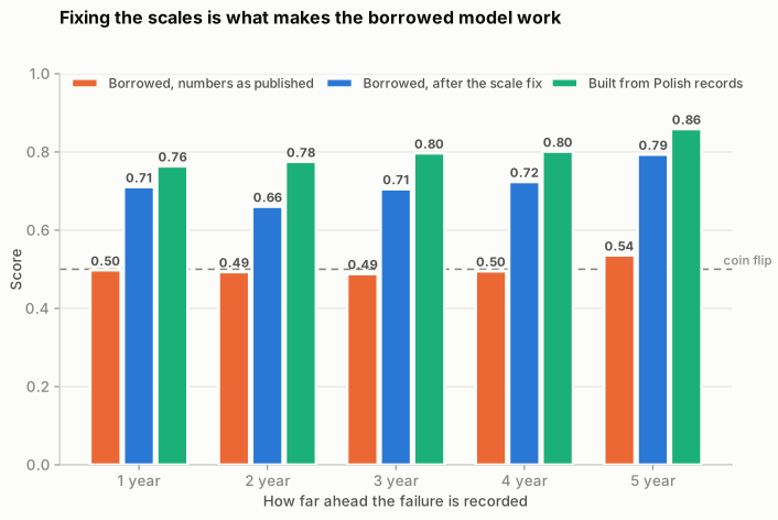
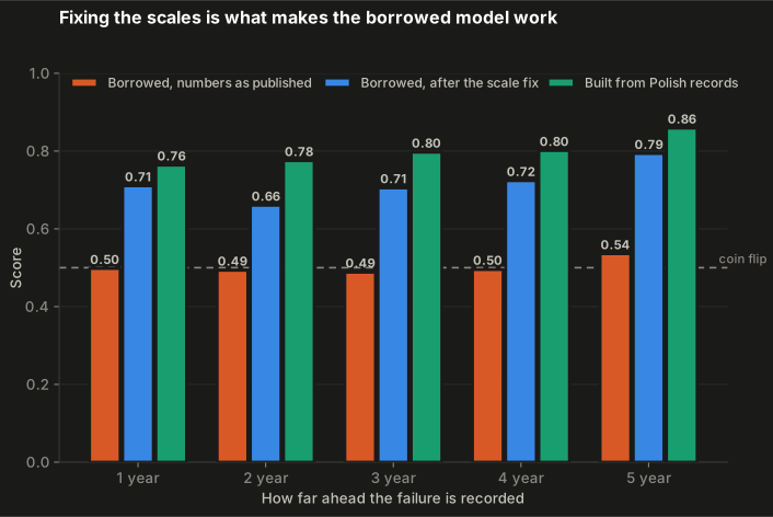
Using the numbers as published, the borrowed model scores 0.49 to 0.54 — no better than guessing, in every forecast window. This is the failure described on the previous page: the two files put their numbers on different scales, so the model was comparing quantities that were never comparable.
Once each company is measured against other companies in its own country, the same model reaches 0.66 to 0.79 — within striking distance of one built from Polish records.
Nothing about the model changed. Only how the numbers were prepared before it saw them.
Why it carries across at all
A borrowed model only works if the warning signs mean the same thing in both places. So before trusting any of the above, it’s worth checking each ratio on its own.
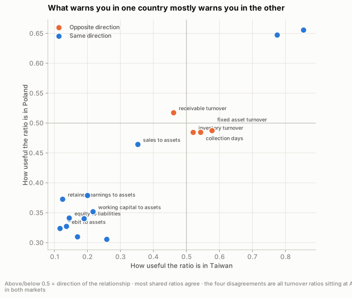
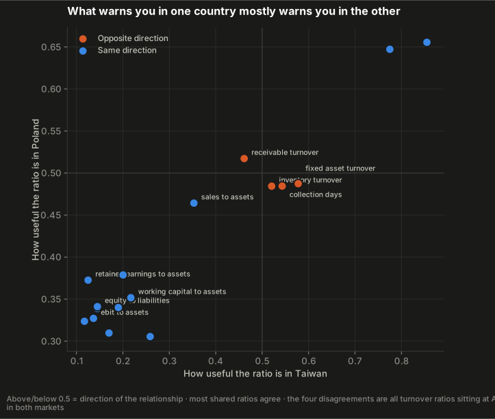
How to read it. Every dot is one of the 17 ratios. Its position left-to-right is how useful that ratio is in Taiwan; up-and-down is how useful it is in Poland. The two grey lines mark 0.5 — the “tells you nothing” point.
Which side of those lines a dot falls on says which direction the warning runs. Above and to the right means a high value of that ratio goes with more failures, like debt. Below and to the left means a high value goes with fewer failures, like profit. Either way, if a dot sits in the bottom-left or the top-right block, the two countries agree with each other. The dots that agree are drawn in blue; the four that don’t are orange.
Thirteen of the 17 agree. Debt level is the clearest: on its own it scores 0.86 in Taiwan and 0.66 in Poland — far from the middle in both. Companies that owe more fail more, in both places.
Four ratios point opposite ways, which sounds like trouble:
| Ratio | Score in Taiwan | Score in Poland |
|---|---|---|
| receivable turnover | 0.461 | 0.517 |
| inventory turnover | 0.521 | 0.484 |
| collection days | 0.543 | 0.484 |
| fixed asset turnover | 0.578 | 0.487 |
It isn’t. Look at the numbers rather than the direction: every one of those eight figures sits between 0.46 and 0.58, against 0.86 for debt level. A ratio scoring 0.48 barely separates failing companies from healthy ones at all, so whether it lands slightly above or slightly below the middle is close to a toss-up.
These four are not contradicting each other. They are all weak in both countries, and the disagreement is noise between two weak signals. All four measure operating speed — how quickly a company collects what it’s owed, or turns over its stock.
Debt, profitability and the ability to pay this month’s bills travel between countries. Measures of operating speed don’t, and aren’t much use in either country anyway.
What each model pays attention to
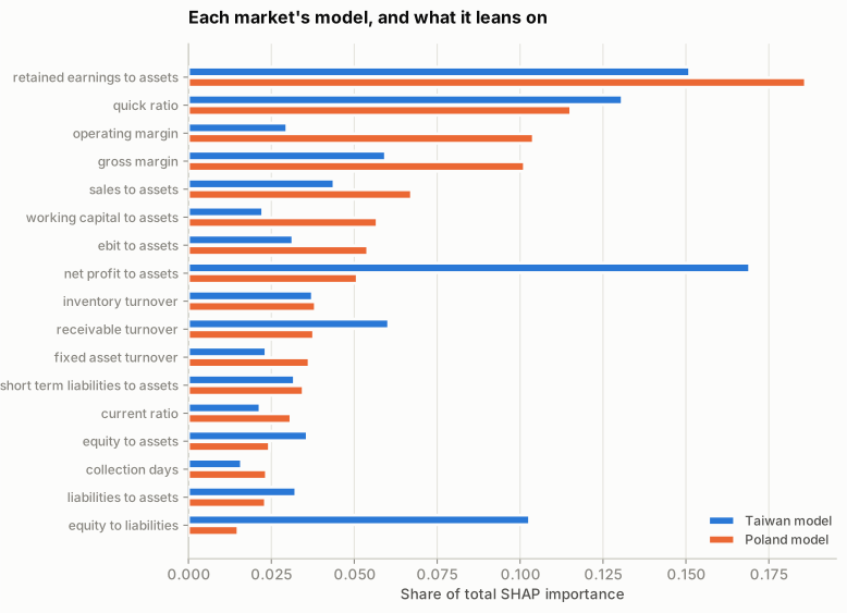
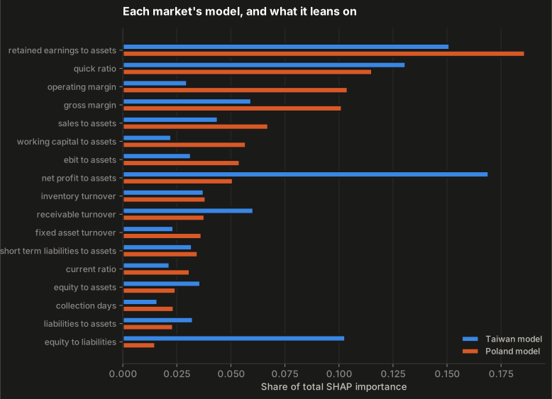
How to read it. Two bars per ratio, one for each country’s own model. A longer bar means that model relied on that ratio more when deciding who was risky. The bars are shown as a share of each model’s total, so the two countries can be compared side by side.
Both models lean hardest on retained earnings against assets — profit the company has kept over its lifetime rather than paid out. It’s a measure of accumulated cushion, and it is the most durable warning sign in both countries.
They part company on this year’s profit, which dominates the Taiwanese model but ranks eighth in Poland. A plausible reason: the Taiwanese companies are stock-market listed and the Polish ones mostly private, and a single year’s profit is both noisier and easier to massage in private accounts.
Was the sophisticated model worth it?
The 17 shared ratios include the five an accountant named Edward Altman singled out in 1968 as the ones that matter for predicting bankruptcy. That invites an obvious test: does modern machinery actually beat a shortlist from 1968?
I ran both kinds of model, each on both sets of ratios — four combinations, each scored twice: working inside Poland, and borrowed from Taiwan.
NoteOne thing this is not
This is not Altman’s original formula. That formula uses fixed weights from 1968 applied to raw figures in known units, and the numbers here have been converted into positions within each country. What’s being tested is his choice of five ratios, with the weights worked out afresh. That’s a smaller claim, and the only one this data supports.
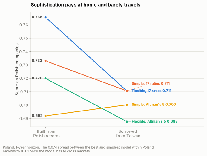
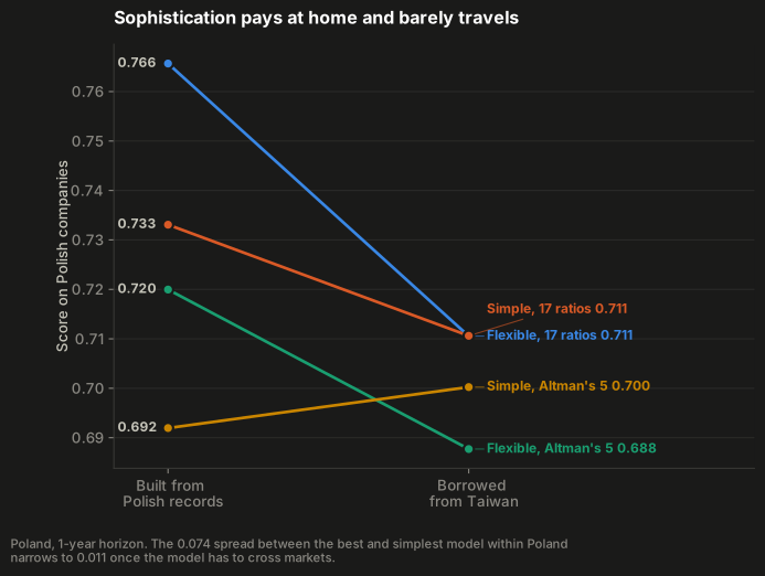
How to read it. Each line is one of the four combinations. The left-hand end is how it scored when built from Polish records; the right-hand end is how the same combination scored when borrowed from Taiwan. A line sloping steeply down lost a lot by travelling; a flat line lost nothing.
The shape to notice is the fan closing. On the left the four are spread well apart — the choice of model matters. On the right they’ve bunched together, which means that once the model has to cross a border, the choice stops mattering much.
| Model | Ratios used | Built in Poland | Borrowed | Lost crossing |
|---|---|---|---|---|
| Simple | All 17 ratios | 0.733 | 0.711 | 0.022 |
| Flexible | All 17 ratios | 0.766 | 0.711 | 0.055 |
| Simple | Altman’s 5 | 0.692 | 0.7 | -0.008 |
| Flexible | Altman’s 5 | 0.72 | 0.688 | 0.032 |
Inside Poland the result is what anyone would expect. The flexible model beats the simple one, and 17 ratios beat 5. Best to worst is a gap of 0.074 — a real margin, and a good reason to reach for the heavier tool.
That margin does not survive the border. Once the model has to travel, the gap between best and worst shrinks to 0.011, and the simple model on all 17 ratios ties the flexible one exactly. Whatever the extra flexibility had learned, it was something specific to Polish companies — and it doesn’t come along from Taipei.
The detail worth noticing is the simplest combination of all. The simple model on Altman’s five ratios is the only one that doesn’t lose ground crossing the border: 0.692 at home, 0.700 abroad. Run-to-run variation is around 0.02, so that small rise isn’t a real improvement. The flatness is the point — it had barely any country-specific fitting in it to lose.
Sophistication pays when the model stays where it was built. When it has to travel, five ratios from 1968 and a simple model get within 0.011 of the best result here.